Your first node
Define a node type and see it appear in the editor sidebar.
What you'll learn
How to define a node, group it into a category, and pass both to the editor so it appears in the sidebar.
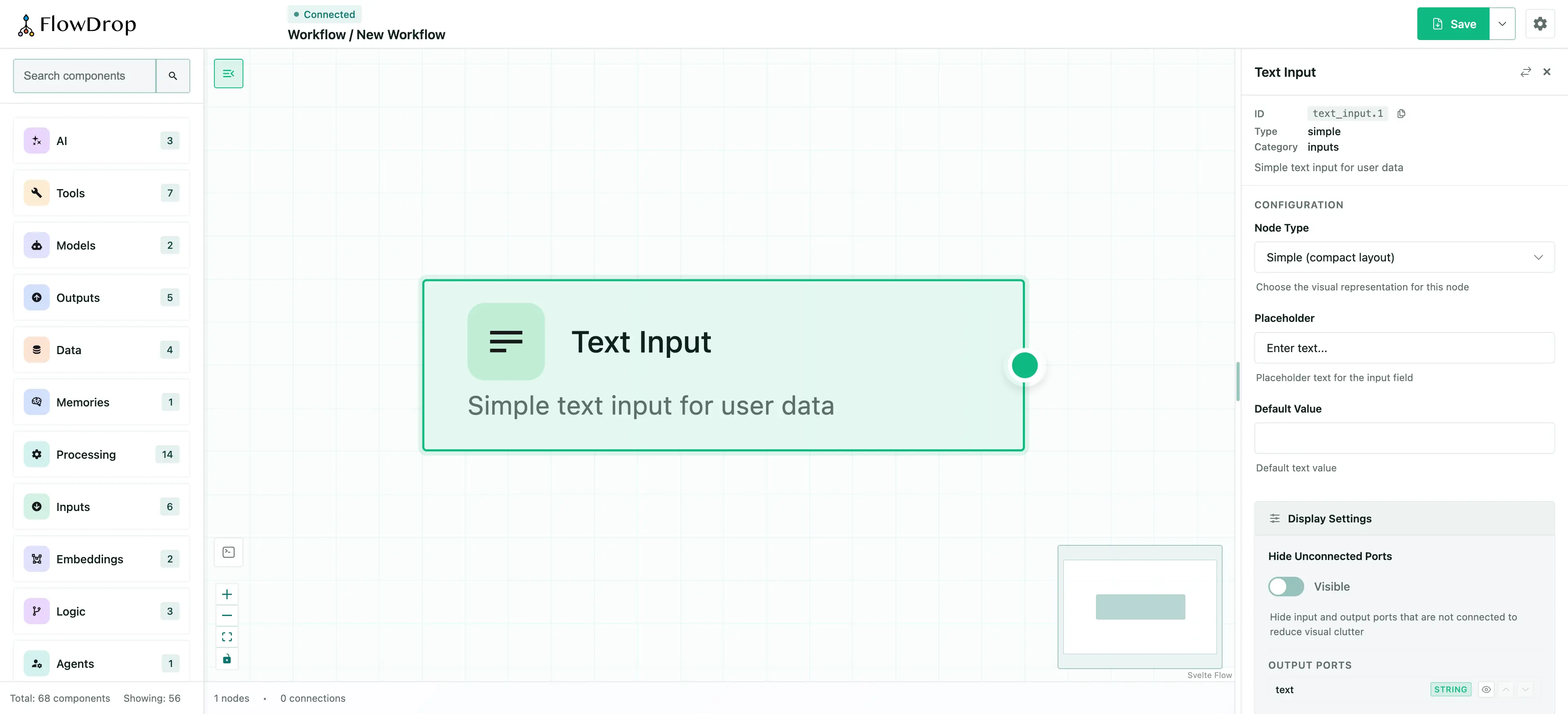
With a single node defined, the sidebar shows a Text Input node under the Inputs category. Users can drag it onto the canvas, then click it to see its configuration form.
Core concepts
FlowDrop needs two things to populate the sidebar:
- Nodes — definitions of the building blocks users can drag onto the canvas.
- Categories — groups that organize nodes in the sidebar.
Defining a node
A node is a plain object describing its identity, appearance, and ports:
const textInput = {
  id: 'text_input',
  name: 'Text Input',
  type: 'simple', // Visual style: simple, tool, gateway, terminal
  description: 'Simple text input for user data',
  category: 'inputs', // Must match a category id
  icon: 'mdi:text', // Any Iconify icon
  color: '#22c55e',
  version: '1.0.0',
  inputs: [], // No input ports
  outputs: [
    {
      id: 'text',
      name: 'text',
      type: 'output',
      dataType: 'string',
      description: 'The input text value'
    }
  ],
  configSchema: {
    // JSON Schema for the config form
    type: 'object',
    properties: {
      placeholder: {
        type: 'string',
        title: 'Placeholder',
        default: 'Enter text...'
      }
    }
  }
};
Key fields:
| Field | Purpose |
|---|---|
type | Controls the visual style of the node on the canvas |
category | Determines which sidebar group the node appears in |
inputs / outputs | Define the connection ports on the node |
configSchema | JSON Schema that generates the configuration form |
Icons
The icon field accepts any Iconify icon identifier in set:name format. FlowDrop uses @iconify/svelte to render icons, which loads them on demand from the Iconify API — so you have access to 200,000+ icons from 150+ open-source icon sets without bundling anything extra.
icon: 'mdi:text'; // Material Design Icons
icon: 'heroicons:sparkles'; // Heroicons
icon: 'lucide:bot'; // Lucide
icon: 'ph:brain'; // Phosphor Icons
Browse all available icons at icon-sets.iconify.design.
Install @iconify/svelte to render icons.
It's an optional peer dependency of FlowDrop; if it's not installed, icons will not render. See the Icons reference for full details, including built-in defaults and fallback behavior.
The configSchema and JSON Schema
The configSchema field uses JSON Schema — an open standard for describing the structure of JSON data. FlowDrop reads this schema and automatically generates a configuration form for each node, so you never need to build form UI by hand.
In the example above, the schema defines a single placeholder property of type string:
{
  "type": "object",
  "properties": {
    "placeholder": {
      "type": "string",
      "title": "Placeholder",
      "default": "Enter text..."
    }
  }
}
This produces a text input labeled "Placeholder" with a default value. You can use any standard JSON Schema features to build richer forms:
| JSON Schema feature | What it generates |
|---|---|
type: "string" | Text input |
type: "number" | Number input |
type: "boolean" | Toggle / checkbox |
type: "string" + enum | Dropdown select |
title | Field label |
description | Help text below the field |
default | Pre-filled value |
Learn more about JSON Schema.
The full specification is at json-schema.org. The Understanding JSON Schema guide is an excellent starting point if you're new to it.
Defining a category
A category groups related nodes in the sidebar:
const inputsCategory = {
  id: 'inputs',
  name: 'Inputs',
  icon: 'mdi:import',
  color: '#22c55e'
};
The id must match the category field in your node definitions.
Mounting with nodes
Pass the nodes and categories arrays when mounting, along with the endpointConfig from the previous step:
import { mountFlowDropApp } from '@flowdrop/flowdrop/editor';
import { createEndpointConfig } from '@flowdrop/flowdrop/core';
import '@flowdrop/flowdrop/styles';

const app = await mountFlowDropApp(document.getElementById('editor'), {
  nodes: [textInput],
  categories: [inputsCategory],
  endpointConfig: createEndpointConfig('/api/flowdrop'),
  height: '100vh',
  showNavbar: true
});
Try it
In your editor:
- Open the sidebar and drag Text Input onto the canvas.
- Click the node to open its configuration panel.
- Change the Placeholder value — this is generated from the
configSchema.
What's next
One node is a good start, but workflows need variety. Next, you'll add multiple nodes across several categories to build a full editing experience.
Tutorial — Step 3 of 5